The Photographer’s Workshop Assignment: Composition – Viewpoint
- March 25, 2011 - by Marilou Jaen, in family life, with 0 -
I have mentioned before that I am taking Karen Russell’s Online Class: The Photographer’s Workshop. Week One of the class covers Composition. The material includes topics such as story vs. portrait, the Rule of Thirds, keeping lines straight, and avoiding mergers.
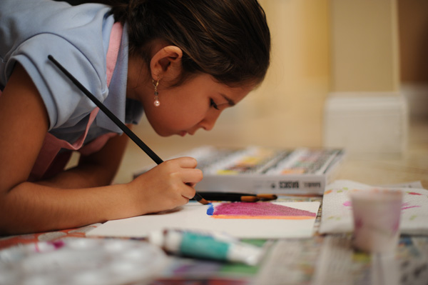
My assignment photos were taken February 22nd, but I’m finally getting around to posting them now. The canvas Isabel is painting was to be a birthday present for her Grandpa the next day. Really, it was a way for me to keep her in one spot and ignoring me all together. Painting, and art in general, has a way of absorbing Isabel that I think is very therapeutic for her.
I picked photos to post where I could get the most value out of the critique (which was done by another student in the class). The assignment is intended to focus on the main theme of the week (versus all concepts learned throughout the class). So, please forgive my under-exposure. Part B covered Viewpoint. Here is my submission.
Photo One:
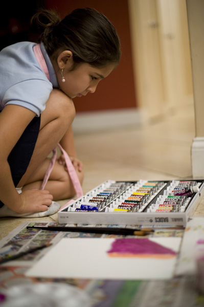
TPW Assignment One | Part B | Photo One
My Assignment Comments: I think my story is clearly defined. Here, my daughter, Isabel is picking out a color for her painting. She is indecisive with paints, like I am with everything. I think the column in the right background is distracting, especially because it’s not aligned. If I had maybe stepped to the left and eliminated it, I might have avoided the distraction. But I’d see less of Isabel’s face. I aligned the frame with the art board, but I think the wall edge is a stronger line, so maybe I should have chosen that edge. I like how this viewpoint really captures her at her level and shows her expression more than a higher viewpoint would.
Photo Two:
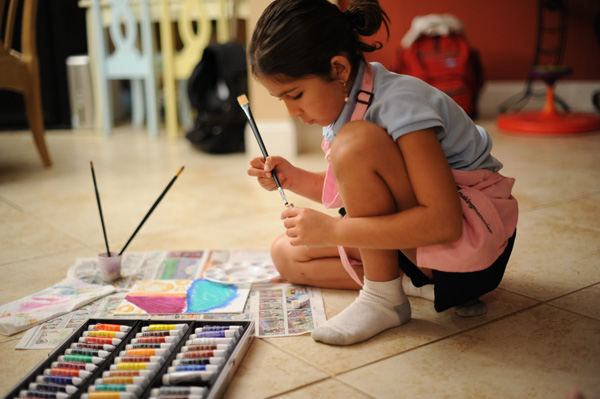
TPW Assignment One | Part B | Photo Two
My Assignment Comments: I really like everything about this shot EXCEPT the background. It detracts from the story. I do like having the memory of all those things – the Sit & Spin, the kids computer table, their backpacks. But they don’t contribute to this story. I would maybe have framed it so Isabel was in the very right, maybe even framing it into her back. And maybe putting her in the lower right, so at least the chairs in the back weren’t cut-off. I like how into the painting she is. She loves art projects, so I’m really glad to have taken all these photos of her engrossed in the activity.
Here are a few other photos I took while Isabel was painting but did not use for the assignment submission.
Other Photos:
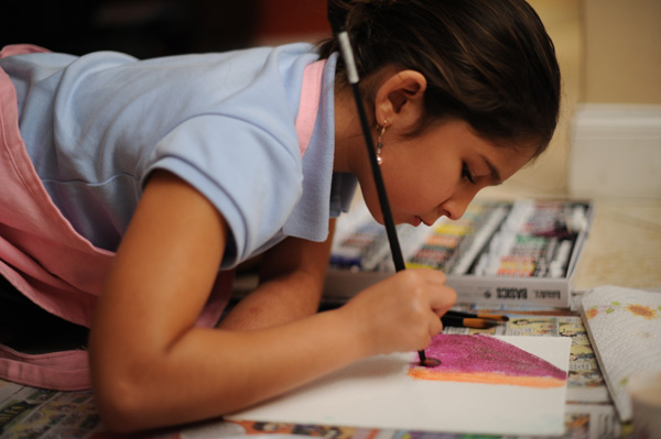
TPW Assignment One | Part B | Other Photos - 1
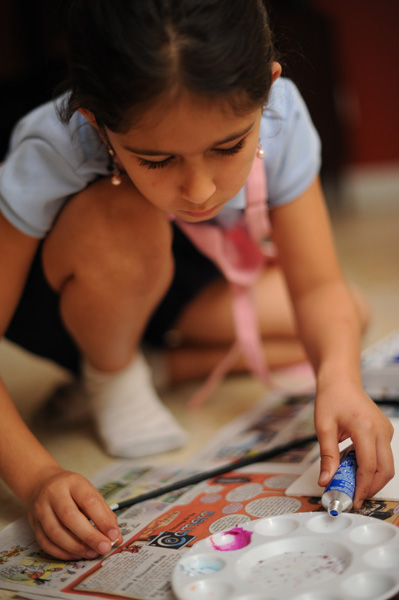
TPW Assignment One | Part B | Other Photos - 2
TPW Assignment One | Part B | Other Photos - 3
